
I've led the visual design work on Fitbit's Charge 3 watch. Collaborated closely together with a UX designer to define UX fundamentals and patterns, that work on a tiny screen. Delivered a unique visual language on a limited 16 shades of grey display, focusing on: Layouts, typography, iconography, animation and data visualization. Worked together with engineers, to deliver a polished and slick design with the limitations such as battery life, refresh rate and other general display limitations. The end result was a one of "the best" fitness trackers in the market and a facelift to Fitbit's
The Verge | TechCrunch | PCMag
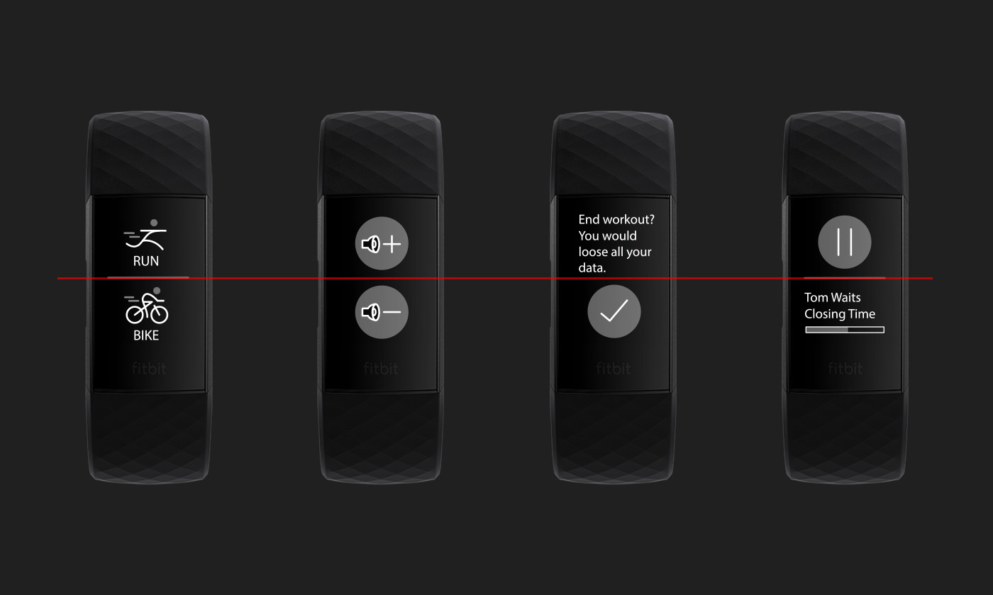
The main grid consistent of two areas, top and bottom. These are used to hold actions or informal components. All types of components be mixed and match to accommodate different app use–cases. A divider could be visible for separation, for cases like list menus
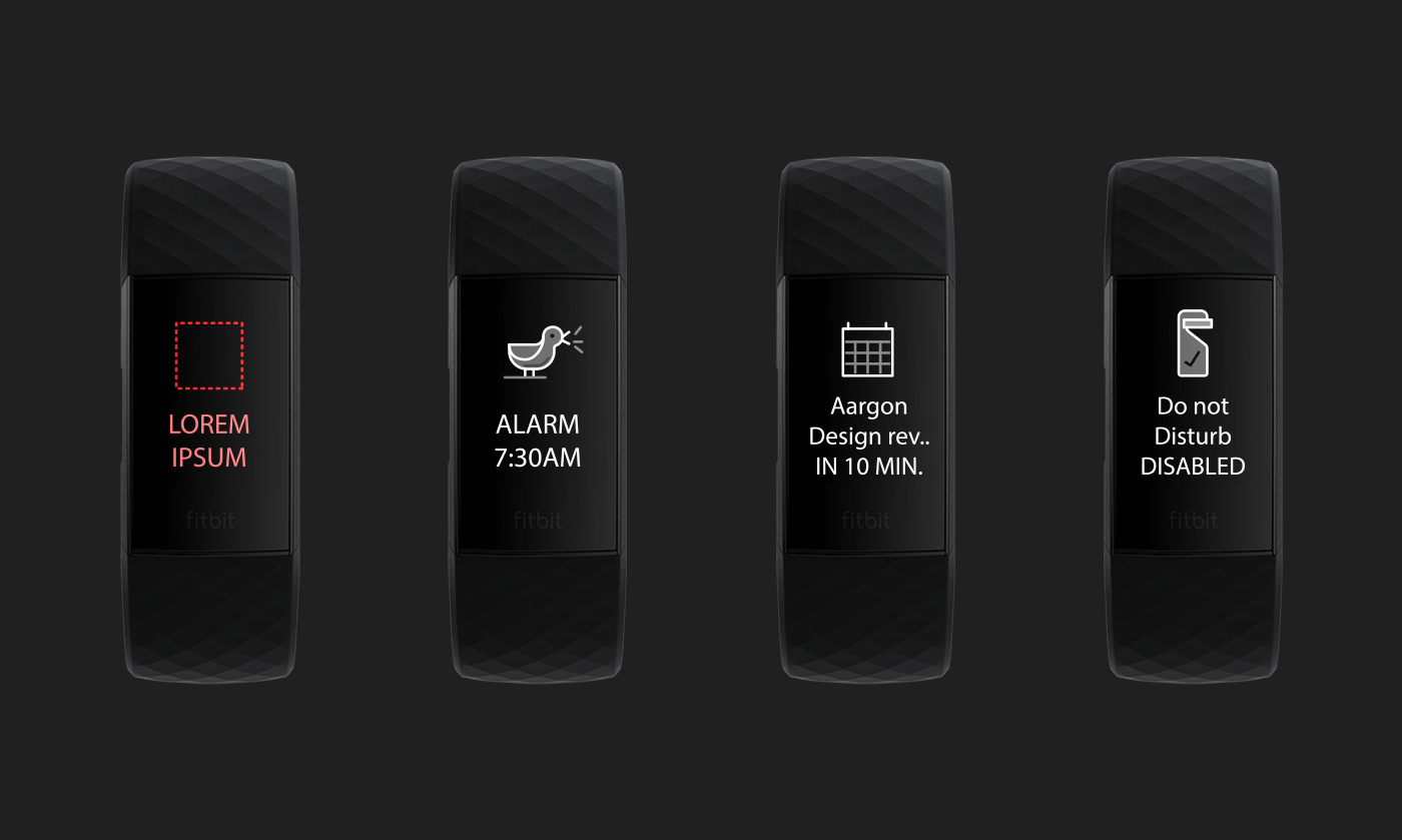
Here is a dialog layout, these are used to surface up important information such as calendar events, alarms and incoming calls. The layout consists of an icon and a short text. In most cases these would animate on top of the existing UI
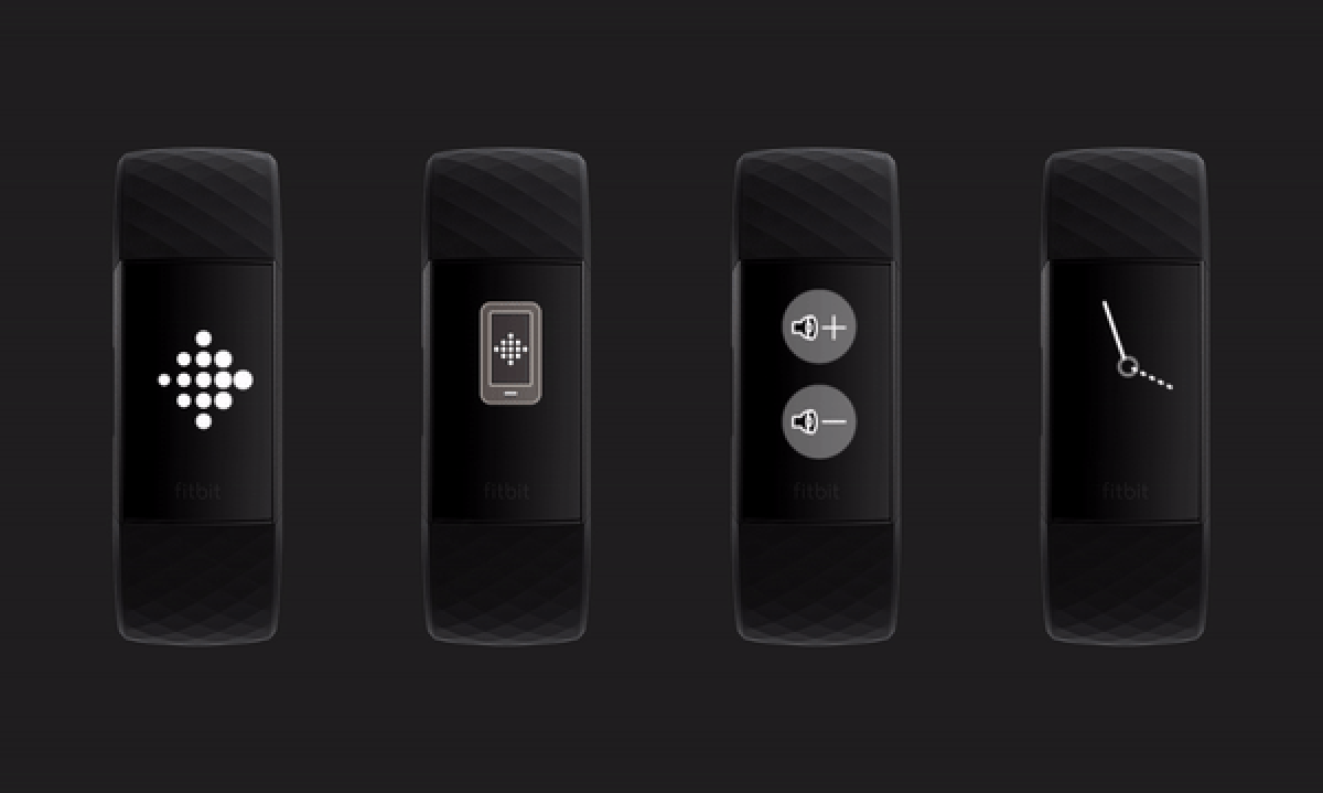
A pretty fast FPS allowed me to use animations in order to give feedback for users, as they interact with the small screen. The use of animation helped to inject personality and life into the device. In the firmware installation part (2 left screens), motion was critical to show progress and ease the experience
This ad–like animation video was done to guide the UI/UX vision and tone of voice, for charge 3. Some of these concepts were later incorporated into the final product.